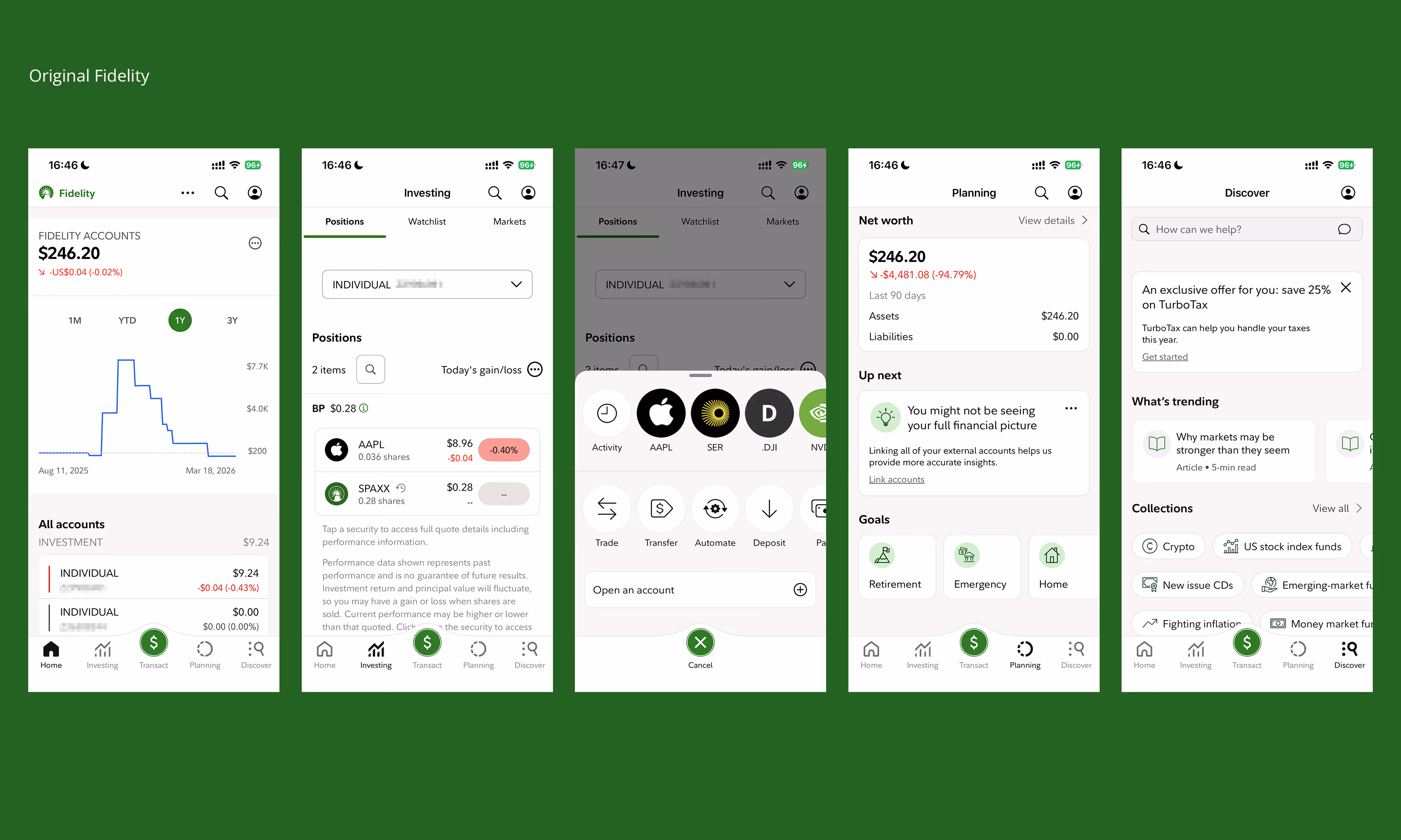
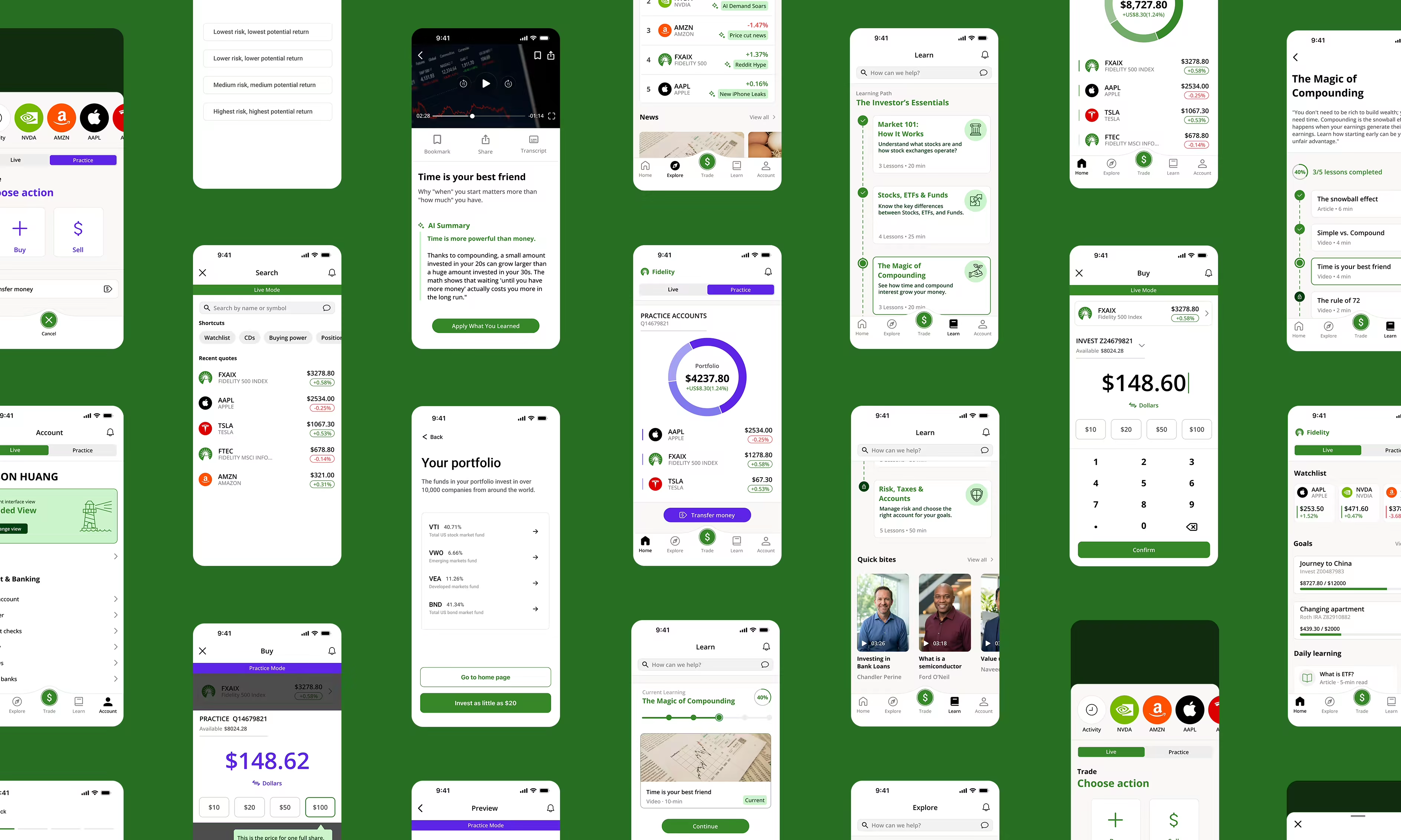
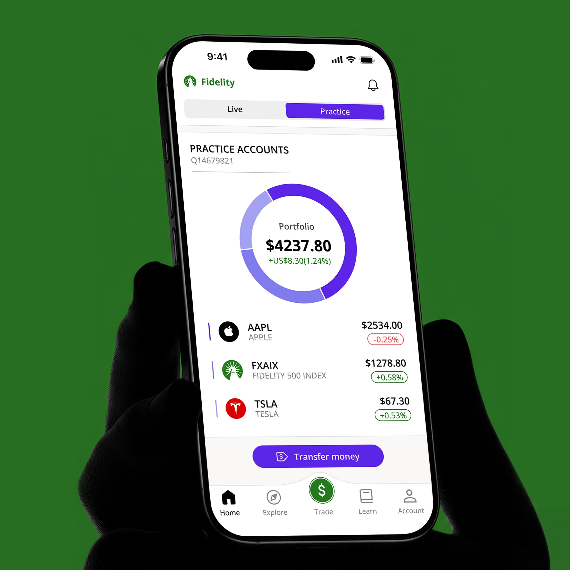
Work
About
Play
Resume
Linkedin
Instagram
Github
Are.na
Category
Digital Product
Year
2025

Fidelity: Guided view

A feature-driven update for the Fidelity app, simplifying investing through a guided interface and a virtual practice mode.

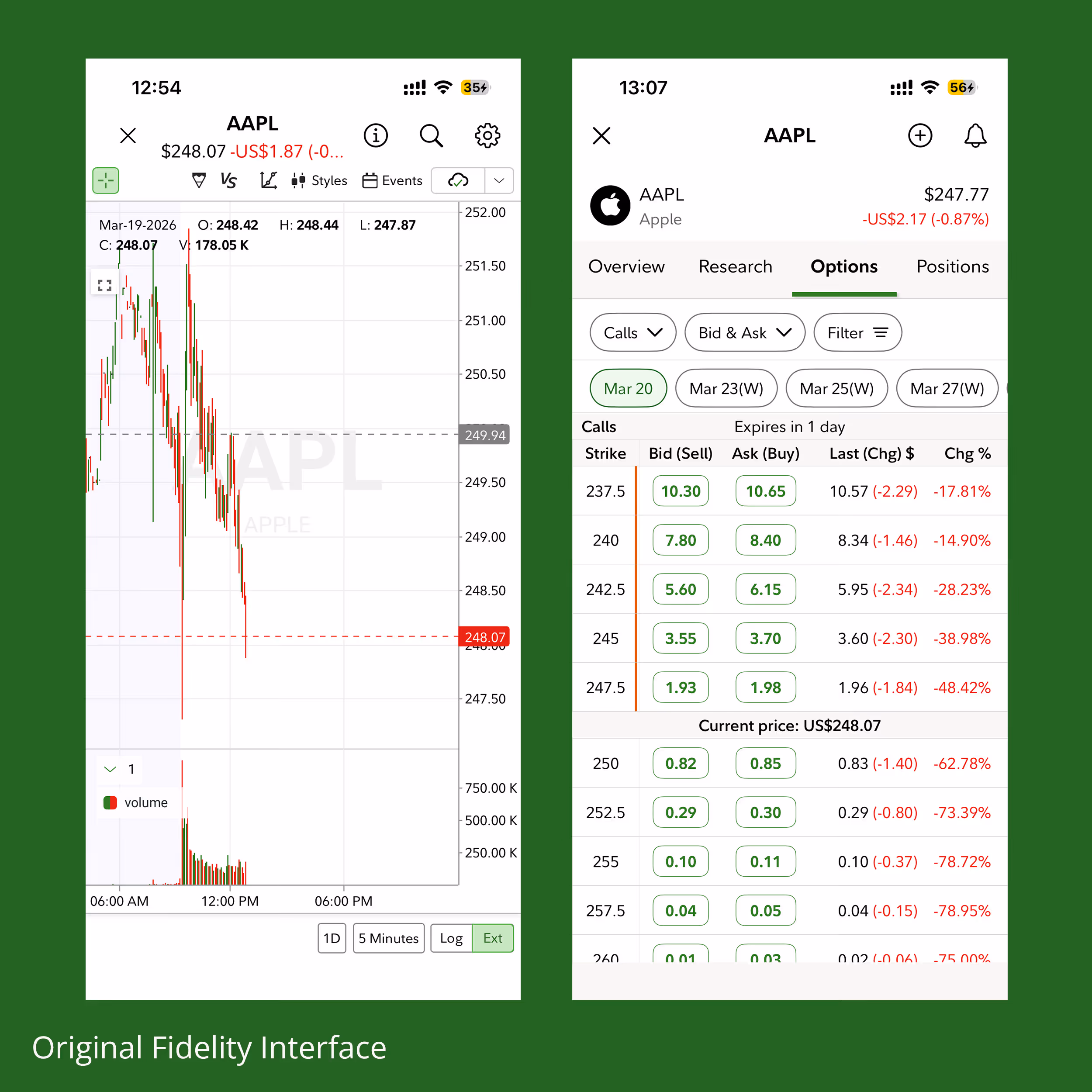
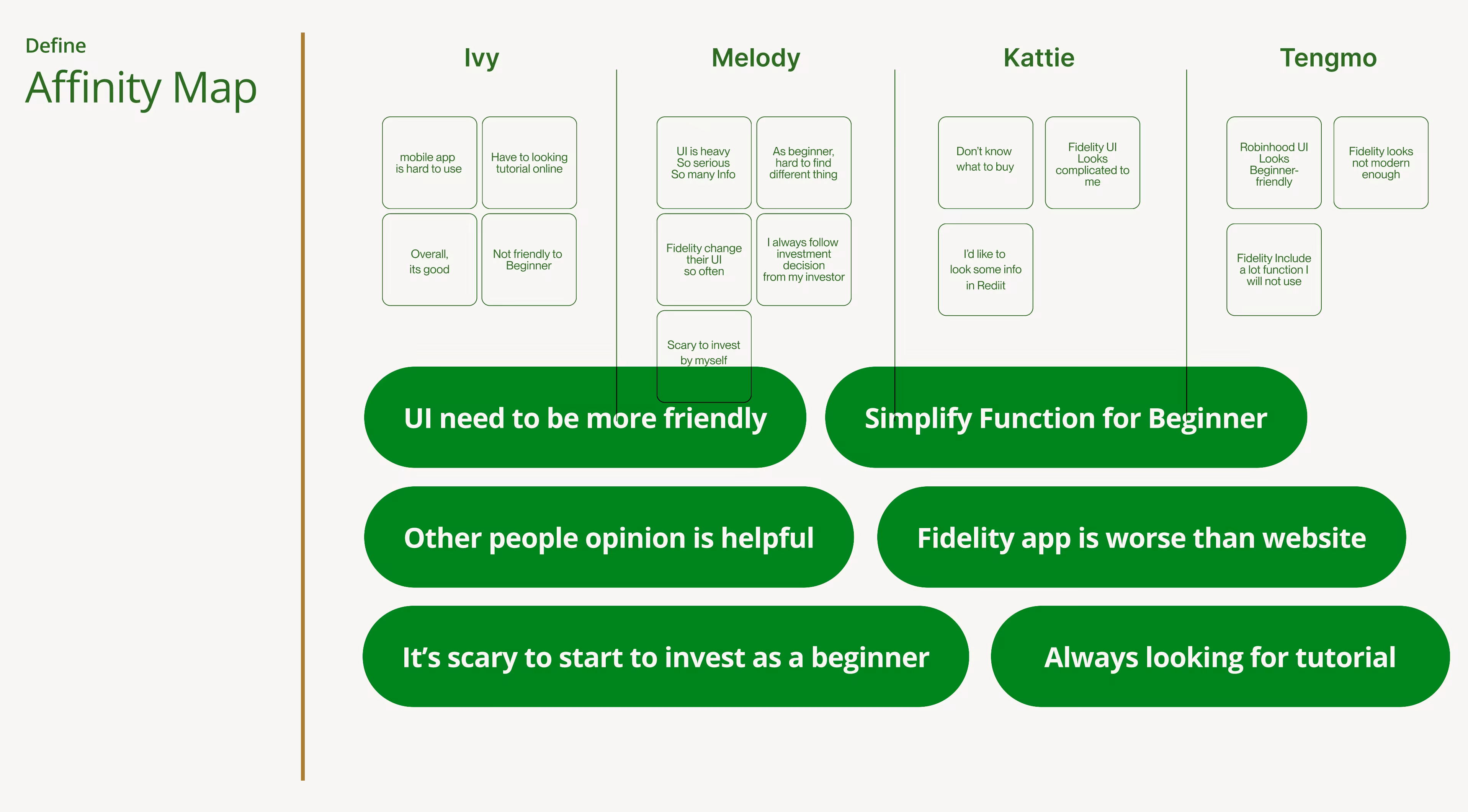
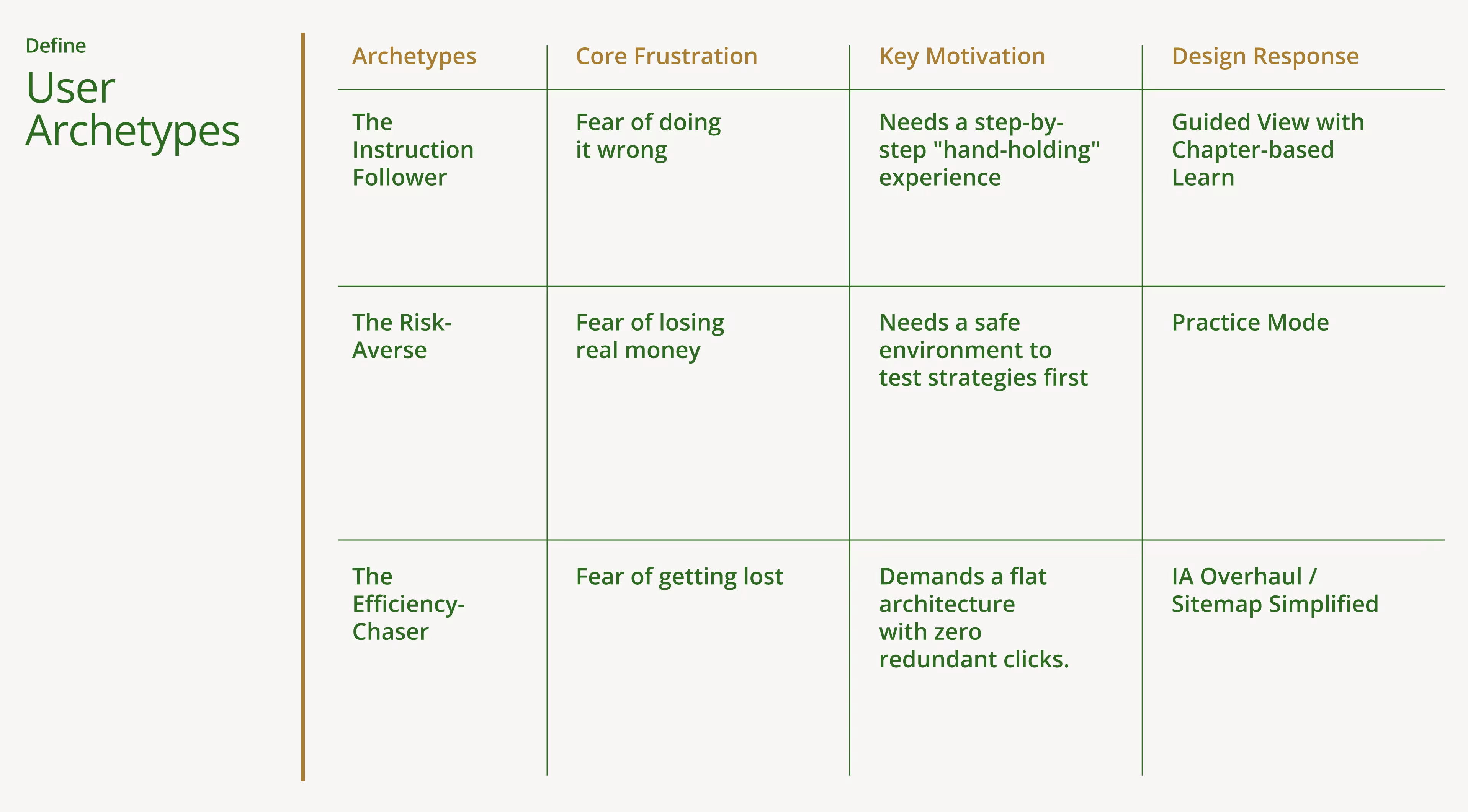
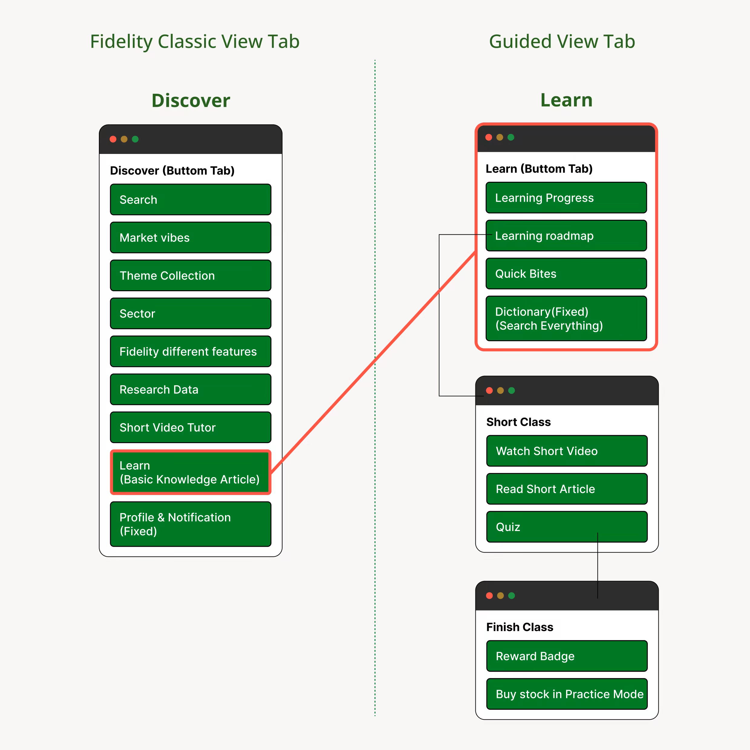
This project addresses the steep learning curve of the Fidelity app for new investors. The “Guided View” feature provides a simplified interface for easier navigation, while the “Practice Mode” allows users to simulate trading in a risk-free environment. Together, these updates lower the barrier to entry, helping beginners build confidence in wealth management.

Problem

The “Entry Barrier”: Why New Investors Struggle with Fidelity.

To uncover the “What” behind these frictions, I conducted in-depth interviews with four target users (Ivy, Melody, Katie, and James). By mapping their journey, I found that their hesitation wasn't due to a lack of financial intent, but [[2 pain points]].

Pain Point 1:
Overwhelming Interface & Technical Jargon
Fidelity’s interface mirrors a professional trading terminal. Users reported that terms like “Bid/Ask” and “Limit Orders” act as barriers. One user noted: [[“Without watching YouTube tutorials, I wouldn't be able to use it.”]] This highlights a massive gap in self-service usability.
Pain Point 2:
Fear of Real Financial Loss
Every interaction in Fidelity involves real money. For beginners, the fear of making an accidental financial loss creates high anxiety. The current system offers no “sandbox” environment, forcing users to learn using real assets, which leads to early abandonment.

Solution

Fidelity Guided View — An Intuitive Ecosystem for Beginners

I designed a tailored, “guided” framework specifically for beginners. By restructuring the navigation logic, filtering out anxiety-inducing information, and integrating a feedback mechanism that seamlessly combines learning with practice, I transformed Fidelity from a complex professional tool into a safe, transparent, and accessible platform for growth.

Feature 01: Guided View (The Core Ecosystem)
This is the core of the entire app. It has completely lowered the cognitive barrier for beginners through four dimensions.
1. Intent-Based Information Architecture
I overhauled the Information Architecture to match how beginners think. By replacing technical jargon with clear actions—[[Home, Explore, Trade, Learn, and Account]]—users can intuitively find their way without needing a tutorial.

2. Emotional Design: De-cluttering Anxiety
To reduce “Market Anxiety,” I removed volatile line charts that often trigger panic in new users. The focus shifts from short-term fluctuations to long-term portfolio health, creating a calmer, more objective decision-making environment.

3. Social Proof through Big Data
The integrated [[Trending]] feature satisfies the beginner’s instinct to follow market leaders. By showcasing popular holdings through real-time big data, users gain a sense of community support and confidence in their choices.

4. Chapter-Based Learning & Feedback
Users receive immediate feedback as they learn or earn money, ensuring that complex financial concepts are understood before moving to the next stage, helping them to reach their financial goal.

Feature 02: Practice Mode (The Risk-Free Sandbox)
After the user completes the learning chapter, provide an absolutely secure “practice area.”
Scenario-Based Simulation
Seamlessly integrated with the Learning modules, [[Practice Mode]] allows users to execute trades in a mirrored market environment using virtual currency. It’s a “Safe Zone” to build muscle memory and test strategies without risking a single penny of real capital.

Try Prototype

Supporting Features
1. Personalized Portfolio Quiz
A conversational onboarding experience that recommends a starting portfolio based on the user's simple goals.
2. Contextual Coach
Interactive prompts that explain “why” and “how” during first trading screen or after learning relevant knowledge.

Research

Understanding the “Entry Barrier”

Methodology
1:1 Qualitative Interviews
Users Samplings
2x Fidelity Users - To identify pain points in the existing Information Architecture (IA).
1x Non-Investor (Interested) - To explore the emotional barriers preventing the first trade.
1x Robinhood User - To establish a usability benchmark for modern fintech tools.

Key Insights: Three Perspectives, One Problem
1. The “YouTube” Gap
[[The Discovery:]] Even existing users feel “abandoned” by the app's professional UI. They often rely on external YouTube tutorials because the internal “Learn” section feels like a disorganized library.
[[Design Response:]] I transformed fragmented info into a Chapter-based Learning Path with immediate feedback.

2. The "Fear of the Unknown"
[[The Discovery:]] For those who have never invested, real-time line charts aren't “data”—they are “stress.” The constant red/green fluctuations trigger a fear of loss rather than a sense of opportunity.
[[Design Response:]] I introduced Guided View (removing volatile charts) and a Practice Mode to build confidence through risk-free simulation.

3. The Usability Benchmark
[[The Discovery:]] Users from simpler platforms (like Robinhood) find Fidelity's navigation heavy and jargon-dense. They expect an “Intent-based” flow (e.g., I want to buy, I want to learn).
[[Design Response:]] A radical IA Overhaul, culling low-priority features and simplifying the main navigation into Home, Explore, Trade, and Learn.

User Archetypes: Defining the Beginner Friction
Although all respondents were novices, they exhibited distinctly different points of anxiety when interacting with Fidelity. These three archetypes determined the subsequent functional direction of the Guided View.

Sitemap: Re-Engineering for the “First Move”
The redesign logic is: “Consolidate the fragmented; simplify the complex.” I deconstructed Fidelity’s intricate, four-tiered institutional-grade architecture and—guided by a goal-oriented mindset tailored to beginners—reorganized it into five core entry points, thereby transforming what were originally fragmented functionalities into a linear growth path.

1. Hierarchy: Collapsing the Nesting
Pruning 20+ low-priority features and collapsing [[4 levels of hierarchy into 2]]. Ensures a “Two-Tap” principle where beginners never have to click more than twice to find a core function, significantly reducing the learning curve.

2. Integration: Goal-Centric Experience
[[“Goals”]] (formerly Planning) and [[“Positions”]] into the Home dashboard. Shifts the focus from “What the market is doing” to [[“Where I am”]] and [[“Where I want to go.”]] Replacing rigid retirement planning with flexible, achievable personal goals makes investing feel less intimidating.

3. Education: Contextual Learning
Extracting “Learn” from the “Discover” sub-menu and elevating it to a Primary Pillar. For beginners, [[learning is not a feature—it’s a prerequisite]]. By making education a top-level anchor, I created a “Learn-to-Practice” loop that fosters long-term user confidence.

4. Action: Operational Noise Reduction
Streamlining “Transact” into “Trade (Buy/Sell)” and “Transfer.” I re-allocated non-core financial tasks (e.g., Buy CDs, Bill Pay, Deposit) to the Account section. By [[stripping away institutional noise]], the interface returns to its primary intent: helping beginners execute their first trade with total clarity.

Next Steps

The Road Ahead

Completing the design proposal is just the first step. To ensure that Guided View is successfully implemented and effectively addresses the pain points faced by beginners, I have outlined the following three core directions:
1. Usability Validation
I plan to conduct a second round of testing with my 5 participants to verify if the [[2-level flat hierarchy]] effectively reduces the “Time-to-Trade” compared to the original 4-level maze.

2. Accessibility Audit
Financial apps rely heavily on red/green signals. I will audit the visual system [[(WCAG 2.1)]] to ensure the simplified charts and status indicators are inclusive for color-blind users and older beginners.

3. Social Sentiment Integration
To solve the “Decision Paralysis” mentioned in my research, I want to further integrate “Trending Insights” into the Explore tab, helping beginners see what their peers are buying to build confidence.

Heading 1

Heading 2

Heading 3

Heading 4

Heading 5
Heading 6

Lorem ipsum dolor sit amet, consectetur adipiscing elit, sed do eiusmod tempor incididunt ut labore et dolore magna aliqua. Ut enim ad minim veniam, quis nostrud exercitation ullamco laboris nisi ut aliquip ex ea commodo consequat. Duis aute irure dolor in reprehenderit in voluptate velit esse cillum dolore eu fugiat nulla pariatur.

Block quote

Ordered list

  1. Item 1
  2. Item 2
  3. Item 3

Unordered list

Text link

Bold text

Emphasis

Superscript

Subscript